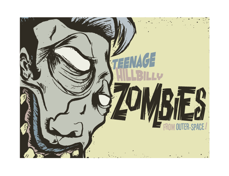
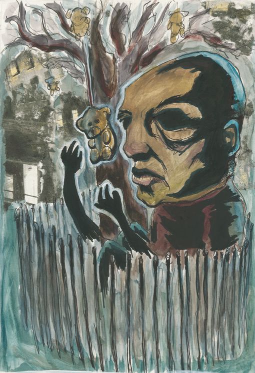
 Just whipped this up today. Did the drawing in class yesterday, wrote some lessons today and wanted to do some art and i really liked the drawing so i decided to make a poster of some kind... maybe i should've added a fictional time and place for some fun. oh well... maybe some other time.

Thursday, October 15, 2009
Teenage Hillbilly Zombies From Outer-Space!
Just whipped this up today. Did the drawing in class yesterday, wrote some lessons today and wanted to do some art and i really liked the drawing so i decided to make a poster of some kind... maybe i should've added a fictional time and place for some fun. oh well... maybe some other time.
Tuesday, October 13, 2009
New and Redone Board Designs
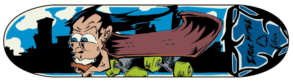
Twenty Eyes
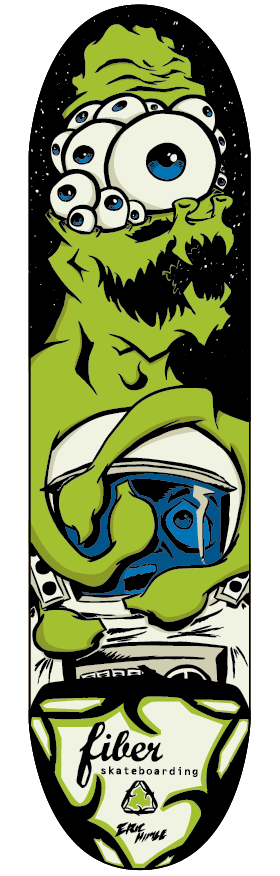 Twenty Eyes... This particular piece is another Misfits inspired work. Mostly in name this time. After all summer of drawing cartoons and learning to economize the drawing and draw it smoother. I also tried to make all the colors flatter by not making them look like it was printed off register. Anyways this is it.
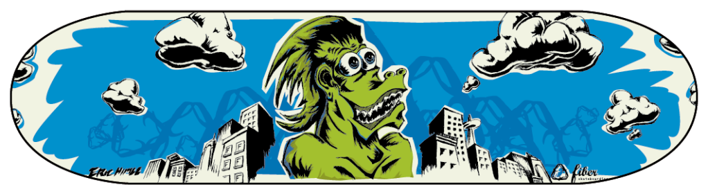
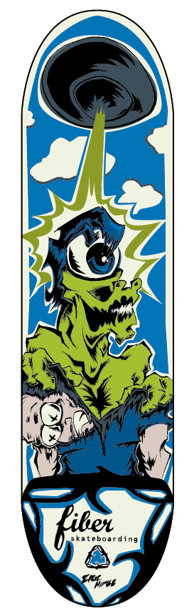 This is the "I turned into a Martian" Board with some revisions done on it. From what I know this should be in production soon. I can't wait to see it come out. I'll have to buy some hardware and really get back to skating.
Eric Himle
Wednesday, August 5, 2009
Recent design jobs and logos
 Okay, It's been awhile since the last post. So here are some things that I have been working on of late. Most of these are logos and design work since my drawings have been all geared towards a goal that I will post about later.
 This first logo "The Tugboat" is for an artist collective my friends want to start with me. We made up the logo today at work since we didn't have any work to do. (don't worry we weren't on the clock).
Trent who is the impetus for this collective drew a tug boat and I put it in illustrator and cleaned and spiffed it up, added a windshield/door, some life preservers and some smoke. I know my Graphic Design instructor from UVU would probably roll his eyes that I used Cooper Black but it seemed to fit the style and name perfect. And I wanted something at the bottom there so I slapped on "modus operandi" for kicks. I like it.

This is a logo design (kinda still in the works) for a designer toy company my friends (same as the friends from the tugboat logo above) wanted to do with me but has yet to see any progress in other than the logo. That I made. This has both the regular and the bloody version. The company is called Teg toys. i'm not sure if i'll put toys on there... probably will some time. The font is just a modified version of Century Gothic, all put together to look like one of those old 70s-80s fisher-price dolls... dead.

 This is a logotype I did for a friend's band called "A Failsafe Story". They are kinda punky, third wave emo
 sounding. If you get a chance I recommend checking them out. This logotype was done after I did a quick logo for
the band but they wanted a regular looking cool looking lettering. So I based this kinda on a font I saw on dafont
but I didn't use that font. I used San Serif and hand kerned the type super tight and changed a couple other things.
I like how this turned out. It kinda looks Modern meets 80s. Simple, bold. says it right. here are the stacked and
horizontal versions.
 This was a project I did at work for a local school's track coach for their cross country camp they have every year. This is completely his idea. I like working with him since he always has great ideas for shirts that let me explore my abilities. Another reason I like this is cause last semester or so walking around BYU I saw some crappy rip off/parody of the Fairley/Obama "hope" poster. It was terrible. At the time I wondered if I could do better. Well here they are side by side so you can judge for yourself. I think it turned out great and even figured how to get those shaded lines just right in illustrator. It was actually quite simple when I thought about for a second.
This was done for my last roommate's website company he is recently doing. I just threw it together for him. Helps to be able to do these type of things to do in exchange for paying for the utilities. I kinda like it. I think in retrospect I would use a different font though...
Monday, July 6, 2009
last year's sketchbooks and other things...
 this was something i was thinking of trying to get out as a self promotional item.. never quite made it... sigh.... its black flag, fyi.
 some astronaut dude...
 mifune in drunken angel... this and the previous were attempts to use photoshop to color rather than illustrator.
 a sketch. the rest are all pen and ink drawings... for a little bit.
 i love this guy's fish sticks! (note: i really don't like fish sticks)
 ivan the terrible.
 a Norwegian dude... possibly a composer...
 some dude...
 a sketchbook i was working in color for...
 from my mind...
 my cartoon version of henry rollins...
 a little typography....
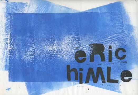
eric
bfa
 this one is claudio of coheed and cambria fame. at the time i was digging them. though their latest output has been less than satisfactory to my ears.
 this is obviously marilyn monroe. i got an award of merit for this one at the student show it was in.
 just some gal.
 beastman! the first and my favorite of this little trilogy.
 trapjaw... one of my favorite characters from the show.
 of course he-man!
 this is pretty self explanatory.
 a cousin of mine wanted a bob marley illustration. this is what i gave him.
 this is the pin... from brick.
 einstien.
 nachoooooooooooooooo.......
 sick of it all from new york city. word up!
 toshiro mifune.... i think from throne of blood....
word...
eric
Wednesday, May 13, 2009
pulp hope envy
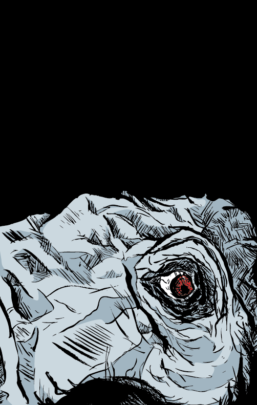 Okay. I've been reading a lot of paul pope's comics lately. The guy is incredible. So i've been trying to mimic his style a little seeing what i can come up with. Unfortunately I can't whip out stuff out of my head like him. I sat down the other night with some time to kill and whipped out this... not sure what else to do with it. but it was a free hand drawing of an elephant... the photo was cropped odd in the first place. i guess it didn't help when i did too.... Anyways a friend of mine says it looks like a dinosaur... maybe i should change the coloring to a more lizard color to give it that effect... who knows...
Fiber Skateboarding
all of these are done with a little bit of an ed big daddy roth/jim phillips style. i like how they turned out.
the first one is in print and can be bought.
 This is the were-o-dile. I drew this up after watching the venture brothers and reading a book on jim phillips.
 the board is available for purchase now. i am a little disappointed with how the colors turned out but otherwise its pretty cool. having a skateboard you designed and all....
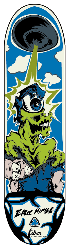 This board i drew while listening to the misfits. In particular the song "I turned into a martian". This is the board i am most excited to see in print. So if everyone buys my other Were-o-dile board this may get printed up!
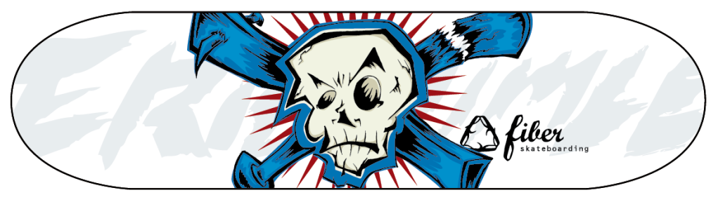 This is a reaction to the rejected skull board in my previous post. Dayna wanted a skull on a board and this is what i came up with. maybe someday this too may be printed up and for sale.
This board i drew while listening to the misfits. In particular the song "I turned into a martian". This is the board i am most excited to see in print. So if everyone buys my other Were-o-dile board this may get printed up!word!
This is a reaction to the rejected skull board in my previous post. Dayna wanted a skull on a board and this is what i came up with. maybe someday this too may be printed up and for sale.we'll see.
eric
fiber boards rejects
here are some boards i've done in the past for friend dayna's skateboarding company fiber. (go buy my board!!!)
these are a couple of rejects. i'll post the three approved ones later.
word.
eric
Monday, April 27, 2009
a comic?
these are some pages i did for my class 450 art ed class for a comic book i was starting to write and draw the images with a friend who did the black and white stuff, while i did the more colorful imagery with this mixed media styling that i've been experimenting with....
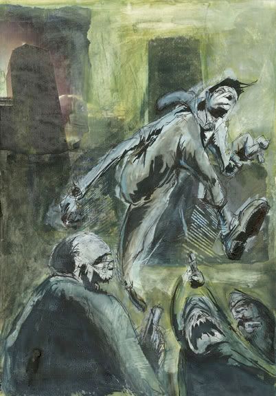
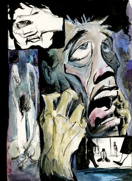
some recent illustrations
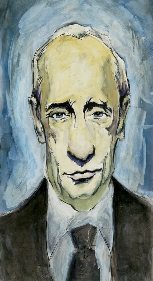
These are some recent illustrations that i've been doing. mixed media and a little sloppy... i think i should try and tighten this style up a little. see where i can take this.
This top one is of putin...
The bottom is just one that is influenced from my reading the book amazing grace for a class.
Thursday, April 2, 2009
Book up for presentation

Presentation... of sorts...
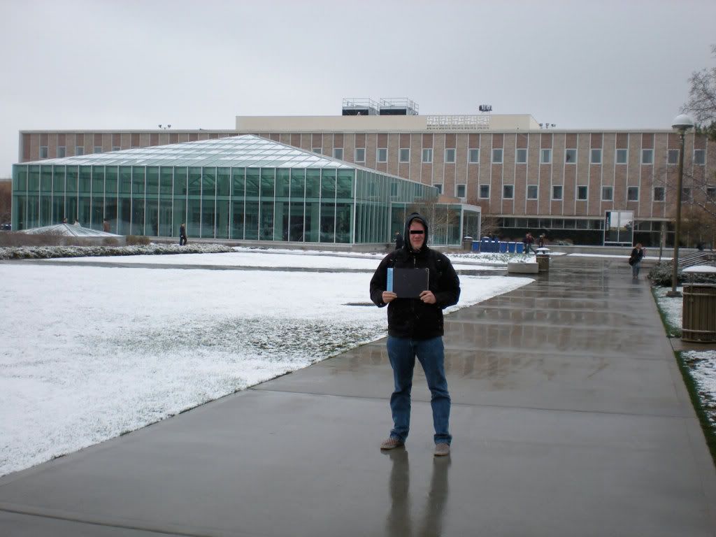
I bound my book and decided to show it in a public place... kinda.
A Library... won't say where, but included a pic if you're in the know you'll be able to find it.
it is under my name in the juvenile lit section.
but hopefully it lasts there for a while....
Tuesday, March 17, 2009
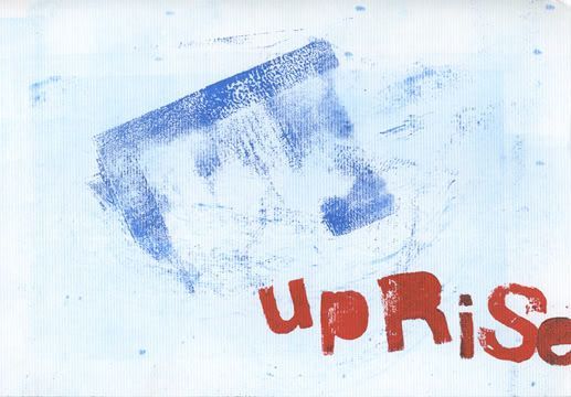
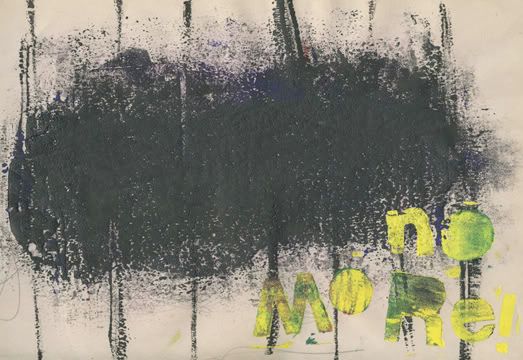
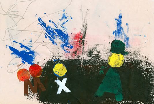
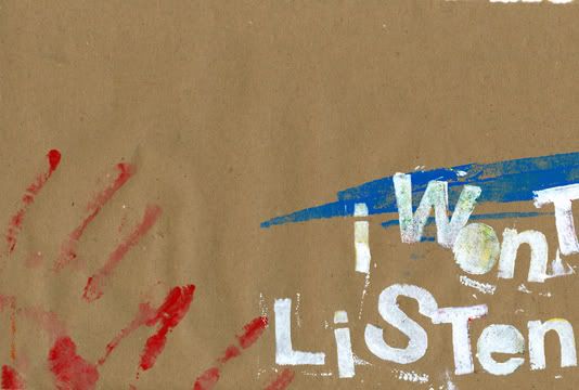
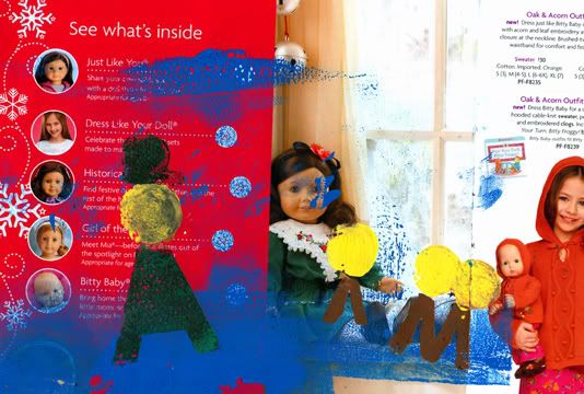
Uprise, book by me
Justification
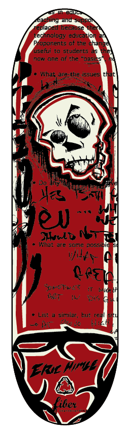
This is a justification for a lesson for Elementary aged students to explore, design, typography, and talking about issues close to them. The following is the main artist I based the lesson and work on and a description of what i produced for the lesson, and the project.
H.N. Werkman
April 29, 1882 – April 10, 1945
His work thrived during the period of time when De Stijl, Dada and Russian Constructivism was the Avant Garde, yet Werkman belonged to none of these movements. He stood apart from these movements, taking his knowledge of the printing press and using the letterforms as graphic element and representational symbols Werkman was a pioneer in subverting the original intent of the alphabet.
Kurt Schwitters, famous Dadaist, clearly influenced by this started to write children’s storybooks to create makeshift characters using strictly letterforms. This can almost be seen as precursor to today’s age of the computer, Internet and text message’s use of emoticons that also subvert the letterforms original intent in order to imitate facial expressions.
The Nazis killed Werkman, in 1945, after invading and occupying his homeland. Why, you may ask? Was it solely for subverting the cause and intent of mere letterforms? No, it was because he used his press, his design skills, and subverted letterforms to create Hassidic stories and poetry, clandestine printed works such as De Blauwe Schuit, and up to forty publications all having rebellious ideas and calling for a spiritual resistance.
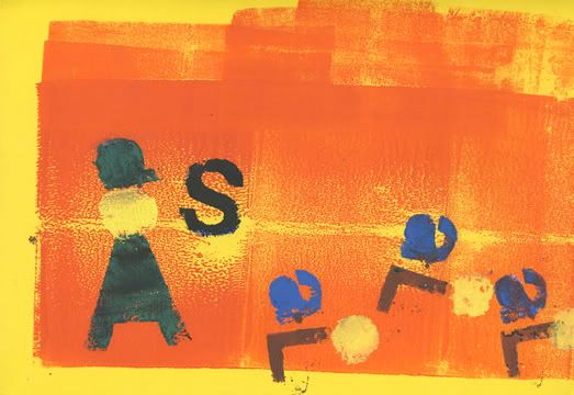
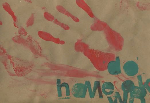
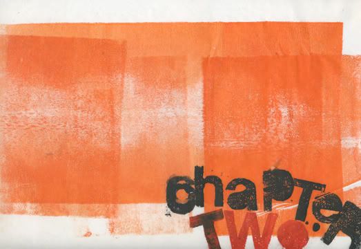
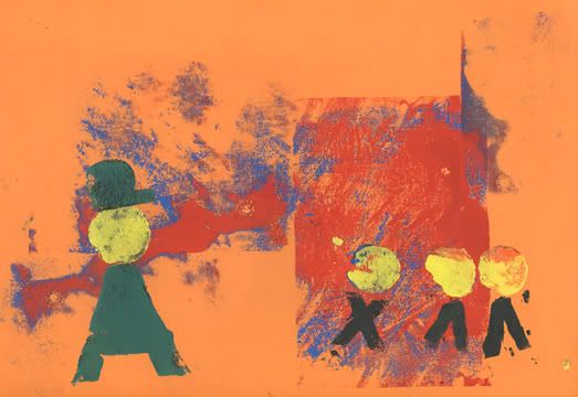
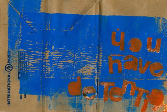
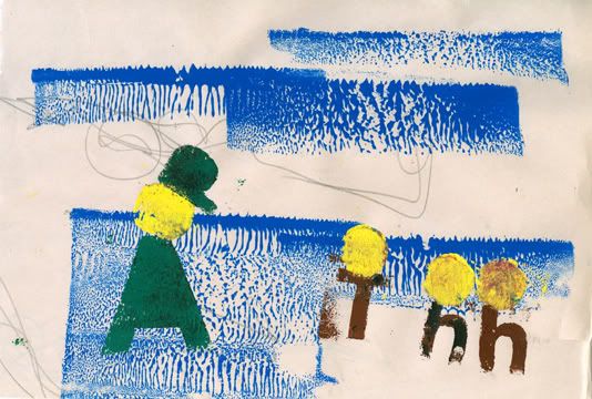
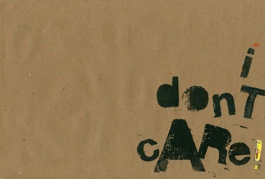
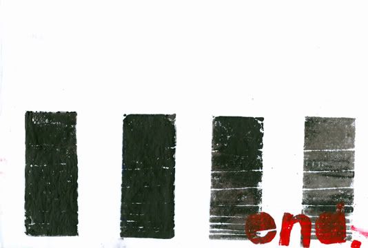
In order to channel Werkman’s aesthetic and ideological stances, Our lesson would be to teach Elementary aged students to use print making techniques, to make stories or poetry by using the letterform outside of its original intent, to use the letterform, or group of letterforms as a graphic element or symbol to make commentary about, or statements of resistance to things that surround their daily life, such as homework, bullies, the unwritten rules of the cafeteria, and so forth.
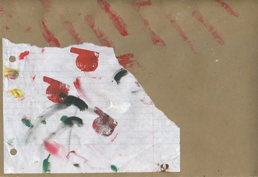
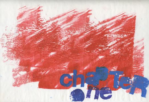
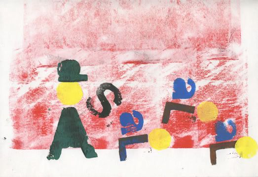
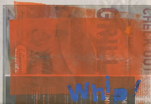
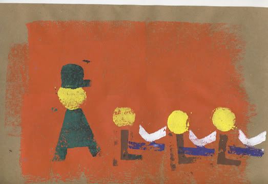
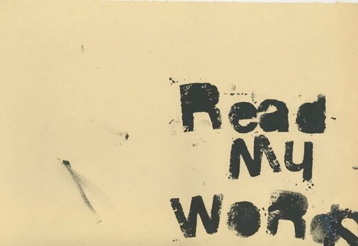
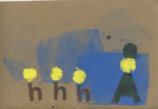
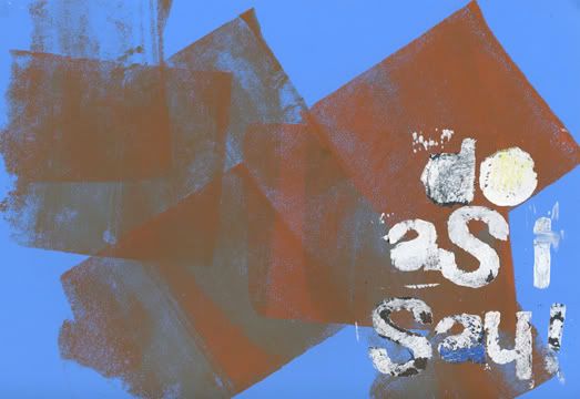
My Book
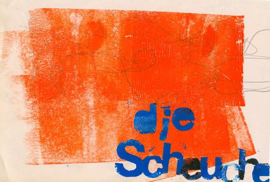
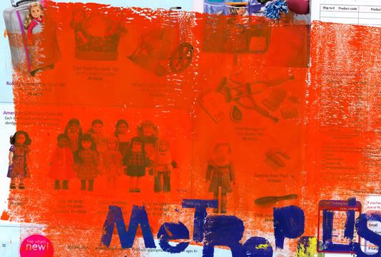
This book is was to replicate the ideas of Werkman into the mind of an elementary student. I tried to incorporate the book Schwitters worked on called die scheuche, where Schwitters and his Dada cohorts use letterforms to create figures or symbols for figures. I also wanted to use the plot line to Fritz Lang’s Metropolis, but time didn’t allow and I truncated it to the point that its really just some corny, simple, youth rebellion storyline, with no real correlation what so ever. Oh well, I still left it in the “Thanks” list.
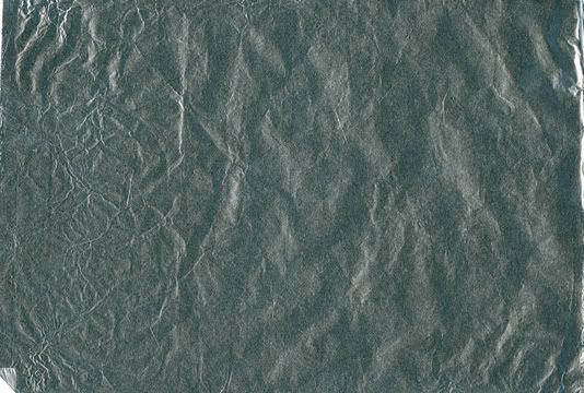
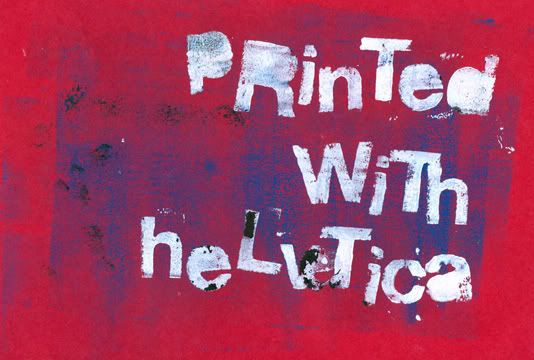
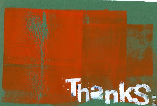
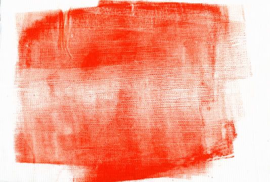
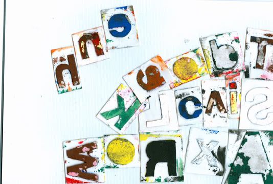
I also challenged myself to use a limited alphabet consisting of the typeface Helvetica, since I’ve been on a Helvetica kick of late. The alphabet I choose was strictly by using the letters from the people on the thanks list and a couple others, like the letter “x”. This posed some challenges in creating dialogue, so I had to be very minimalistic, and straight to the point. All these are printed on paper I found laying about the classroom. Included are butcher paper, paper grocery bags, tracing paper, newsprint with someone’s gesture drawings, tinfoil, clothe, tag board, watercolor paper, and an American Girl catalog, and some others. Its a little corny and i have it now bound up but here are the pages for your viewing pleasure.

Subscribe to:
Posts (Atom)
