Justification
This is a justification for a lesson for Elementary aged students to explore, design, typography, and talking about issues close to them. The following is the main artist I based the lesson and work on and a description of what i produced for the lesson, and the project.
H.N. Werkman
April 29, 1882 – April 10, 1945
His work thrived during the period of time when De Stijl, Dada and Russian Constructivism was the Avant Garde, yet Werkman belonged to none of these movements. He stood apart from these movements, taking his knowledge of the printing press and using the letterforms as graphic element and representational symbols Werkman was a pioneer in subverting the original intent of the alphabet.
Kurt Schwitters, famous Dadaist, clearly influenced by this started to write children’s storybooks to create makeshift characters using strictly letterforms. This can almost be seen as precursor to today’s age of the computer, Internet and text message’s use of emoticons that also subvert the letterforms original intent in order to imitate facial expressions.
The Nazis killed Werkman, in 1945, after invading and occupying his homeland. Why, you may ask? Was it solely for subverting the cause and intent of mere letterforms? No, it was because he used his press, his design skills, and subverted letterforms to create Hassidic stories and poetry, clandestine printed works such as De Blauwe Schuit, and up to forty publications all having rebellious ideas and calling for a spiritual resistance.
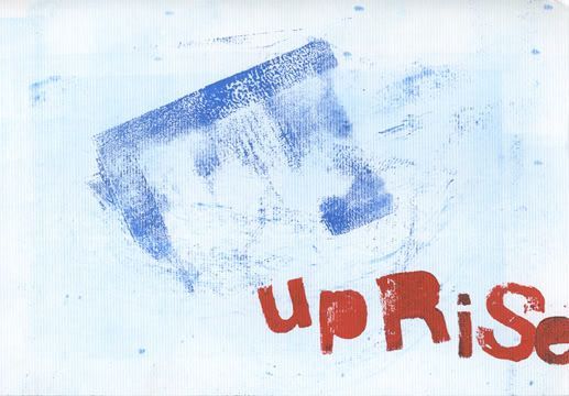
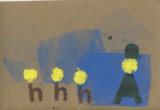
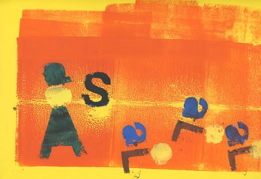
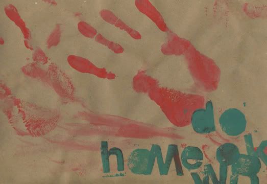
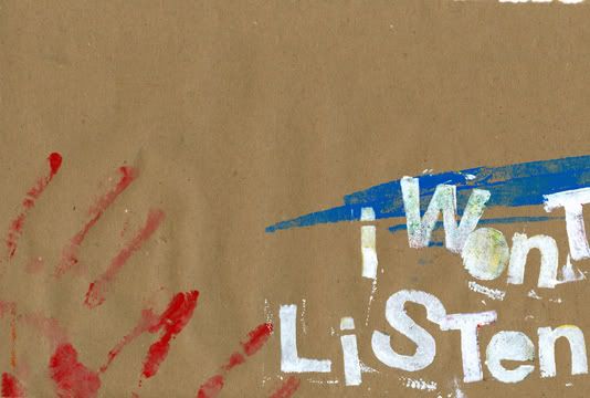
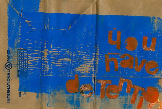
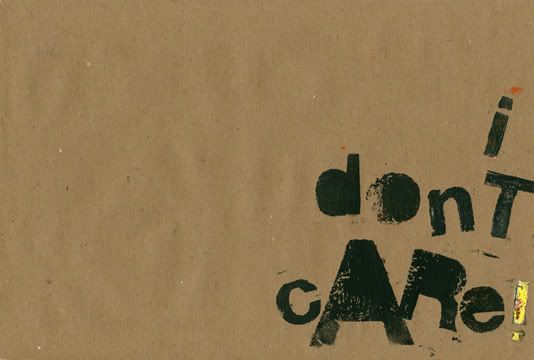
In order to channel Werkman’s aesthetic and ideological stances, Our lesson would be to teach Elementary aged students to use print making techniques, to make stories or poetry by using the letterform outside of its original intent, to use the letterform, or group of letterforms as a graphic element or symbol to make commentary about, or statements of resistance to things that surround their daily life, such as homework, bullies, the unwritten rules of the cafeteria, and so forth.
My Book
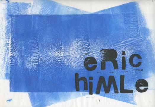
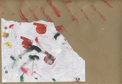
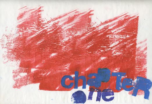
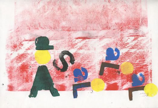
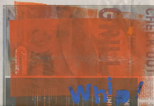
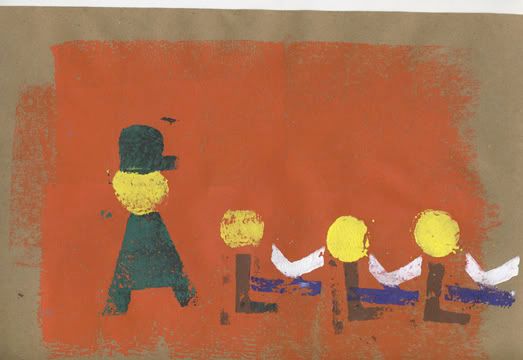
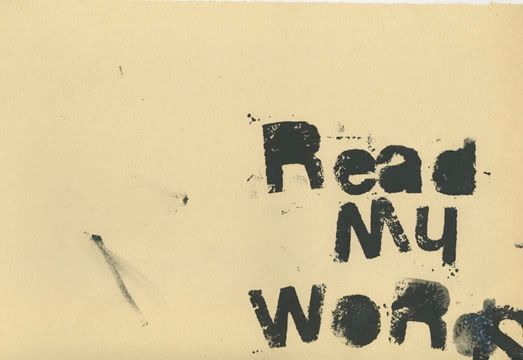
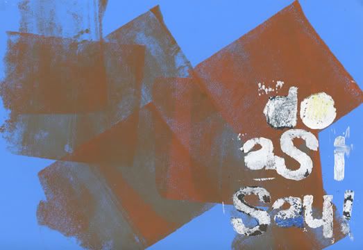
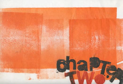
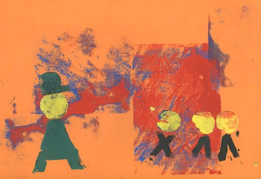
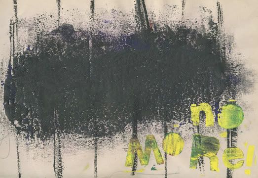
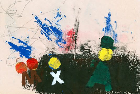
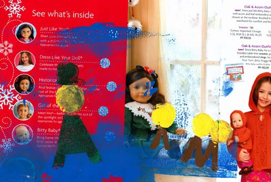
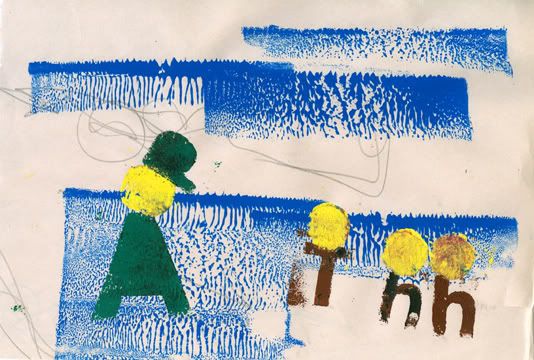
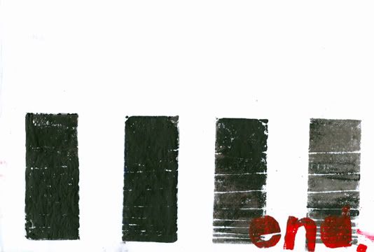
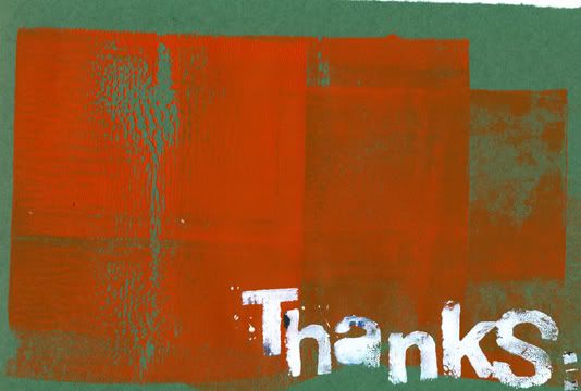
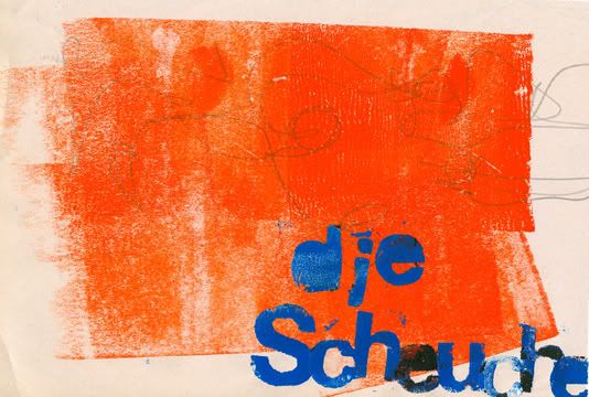
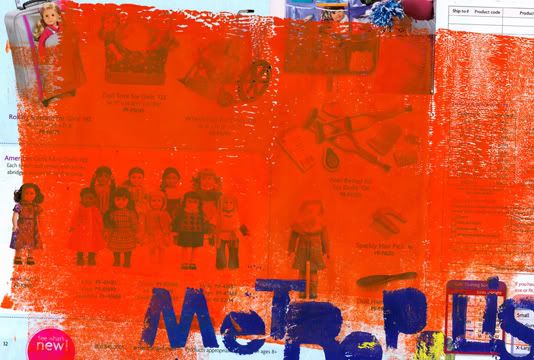
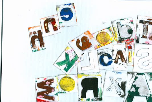
This book is was to replicate the ideas of Werkman into the mind of an elementary student. I tried to incorporate the book Schwitters worked on called die scheuche, where Schwitters and his Dada cohorts use letterforms to create figures or symbols for figures. I also wanted to use the plot line to Fritz Lang’s Metropolis, but time didn’t allow and I truncated it to the point that its really just some corny, simple, youth rebellion storyline, with no real correlation what so ever. Oh well, I still left it in the “Thanks” list.
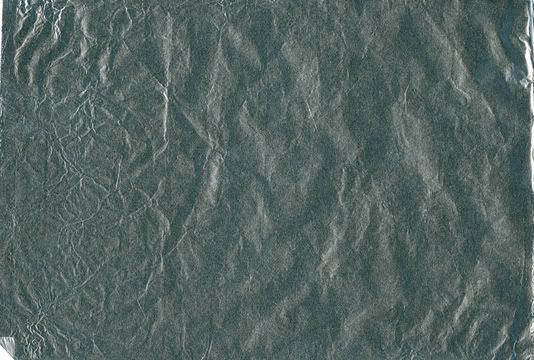
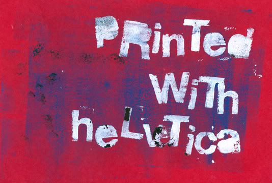
I also challenged myself to use a limited alphabet consisting of the typeface Helvetica, since I’ve been on a Helvetica kick of late. The alphabet I choose was strictly by using the letters from the people on the thanks list and a couple others, like the letter “x”. This posed some challenges in creating dialogue, so I had to be very minimalistic, and straight to the point. All these are printed on paper I found laying about the classroom. Included are butcher paper, paper grocery bags, tracing paper, newsprint with someone’s gesture drawings, tinfoil, clothe, tag board, watercolor paper, and an American Girl catalog, and some others. Its a little corny and i have it now bound up but here are the pages for your viewing pleasure.