Friday, April 5, 2013

NYxHC and Madball...


Here is a poster to show your love for NYHC.
Drawings were done based on the Photography of Dan Rawe.
The main centerpiece is Freddy Madball presiding over a swirling moshpit of bodies. 
In the background are an assortment of NYHC personalities from bands such as Cro-Mags, Sick of It All, Agnostic Front, Madball, and Underdog. 


This is a Digital print on Lustre Photo Paper. 
The print is 16" x 20" ready to be framed and put on your wall. 

$30 Free shipping.

Available here:
Etsy Store.

Eric Himle

Sorceress

Here is a new Intaglio Dry Point Etching Print done by me. 
It is hand etched, printed and painted with watercolors. 
8" x 12" print, means its affordable to frame.


There were 12 in the print run with only 8 left. 
Get one fast before they are gone. 

$30 shipped.

etsy store.

Eric Himle

Thursday, December 13, 2012

Merry Christmas Pt. II


Hey Folks,

Here are two new versions of this drypoint print that I did. 
One just Black and White and the other with a one Color hand tinted.


Here are a couple examples. Now on sale at my shop.

EHIMLE SHOP

Eric

Monday, December 10, 2012

Merry Christmas!

Having a Merry Christmas? 
Want to help me provide one for my wife and kids, and get a cool piece of art?
I've got a new print in my shop. 
Makes a great present to your favorite Metalhead, Goth, Wierdo.


MY SHOP.


Wednesday, November 7, 2012

MFA Assignment

Here is my first MFA assignment from my MFA program at The University of Hartford for their MFA in Illustration program. Here is the program's website, I highly recommend it. Squint.

The first finished art assignment (there have been many drafts, thumbnails, and written papers) is to create a magazine cover in the fashion of a famous illustrator, mimicking their style on a cover of a magazine they would've worked for, all with a celebrity of the time featured on the cover. 

I did two. The first one is modeled after J.C. Leyendecker's style (I know it's not quite there but I did my best) for the Saturday Evening Post. It is of the first star of football... Jim Thorpe. I probably should've included his name on the byline at the bottom but was really pressed for time and didn't feel I had time to find the font used on the Saturday Evening Post or recreate it. Probably should've anyways. 


This second one I did last second. It is in the style of James Montgomery Flagg for a Time Magazine cover in his day. When compared to the Post, one must wonder how Time survived with such a bland cover and art director.
This Portrait is more of a traditional portrait of Red Grange. I did this one since I feel more comfortable drawing, especially in pen and ink and wanted to see if my initial gut feeling to try and tackle Leyendecker was wrong or not. Then again Flagg's style (although a knock off of Charles Dana Gibson) is pretty tough too. I'll probably take both with me to the contact period. 


Why football celebrities? Well it is the season, is it not?

Word

-E


Some Cartooning Stuff and What Have You

I've never been asked by anyone at my church to do any drawings of any sorts... 
But a couple weeks ago I was asked and ripped this out one saturday. 
Hopefully they don't want me to do more this quality or I could get busy. 


Here are some pages that I put together for a portfolio for a Job in the animation industry for a Character Sketch artist... 
Unfortunately by the time I got the portfolio off with some other stuff the job was taken off the market... 
Oh well maybe some other time. I've kept most of these off the blog since they are sketches for a graphic novel I'd eventually like to do. 
There are also a few other things mixed in over the years. 


Hopefully you see some stuff you like.

Word.

-E

Wednesday, July 4, 2012

Paintings from this year so far.

Hello Everyone, 


I am on the eve of going out to Hartford, CT to start my MFA in Illustration.  Link


Here are a few Paintings I've recently done. I've been trying to get better at painting as it is the coolest medium to create art with (other than pen and ink).


I've experimented with various mixed media techniques and have found this one to be of my liking. It is a process inspired by C.F. Payne and Sterling Hundley. 


The Monster/Devil is my latest one. Followed by the Roosters, which I painted for my mother—who loves roosters—for her birthday and a multiple perspective boot I did as a classroom demonstration. The last one is just a Watercolor painting of a Manikin bird. I like drawing and painting birds. Enjoy.


-Eric

Thursday, March 1, 2012

Super Mario!

Well here is my latest project. I'm apart of a video game art show at Trolley Square in the Hive Gallery. I would've gone with Burgertime, Rampage, Streets of Rage, Toejam and Earl, or something I always found fun to play. I will be honest. I wanted to get some attention, and get people interested in my art, so I went with some Mario themed posters. Oh well.


Enjoy.
E.

Saturday, December 31, 2011

BACK!

Hello out there in blog land,
I've been busy with my new semester and haven't had time to post much. I have had two new classes and have been prepping for those new lessons quite a bit.

What you will find below are some images of some of the stuff I've worked on both for school or personal projects. I now have all of these for sale at my Etsy shop. Please stop by and pick something up (click on the link that says Etsy Shop).


This first piece here I would like to give some background. I did this for the 24 hour art show this year at the Hive Gallery in Trolley Square, SLC. Its 12x12 and silk screened to canvas, attached to a cradled board. I also applied glow in the dark ink. Looks cool to me, but didn't sell... sigh...

So now is your chance to own it.

Wednesday, July 27, 2011

Attack of the Manimals!


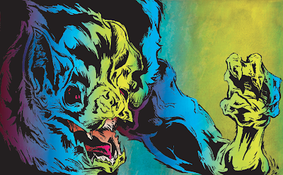
Okay. I've been working on a series of these half man, half animals over the course of about a year. Some have been gruesome and scary, others wearing formal evening wear and business suits. Much like my previous post, I've been sitting on these drawing for a while trying think of how I would paint them. So, after being inspired by the last project I came up with these. Enjoy.


(This one has a little M.o.t.u.s. color scheme going on that I like).

I also colored out this little face I had drawn out from a few months ago.

If you would like to see a little more detail just click on the image.

Word.

About Me

My photo
Sandy, Utah, United States

Followers